
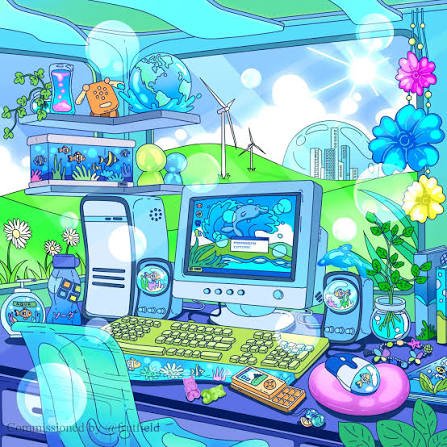
Frutiger Aero was one of the most recognizable design styles of the mid-2000s and early 2010s. It appeared on computer operating systems, mobile phones, gaming consoles, websites and advertisements. The style mixed modern technology with images of nature to create a bright, clean and futuristic world.
Although millions of people grew up seeing these designs, most had never heard the term Frutiger Aero until years later. Today, the aesthetic has found a new audience through social media, nostalgic videos and internet memes.
What Is Frutiger Aero?
Frutiger Aero is a visual aesthetic that was widely used between approximately 2004 and 2013. It is known for glossy surfaces, transparent windows, realistic icons, colorful backgrounds and nature-inspired images.
Think of an old Windows Vista desktop, a shiny blue button on a website or a wallpaper showing tropical fish swimming through crystal-clear water. These are familiar examples of the Frutiger Aero look.
The style often combined two ideas that might seem unrelated: advanced technology and the natural world. A futuristic city could appear beside green hills, while digital screens featured water droplets, clouds and sunlight.
Frutiger Aero was more than a collection of attractive pictures. It reflected a time when technology companies wanted computers and the internet to feel exciting, friendly and full of possibilities.
Where Did the Name Frutiger Aero Come From?
The name Frutiger Aero was not commonly used when the aesthetic was at its peak. It was introduced years later to describe a design trend that had already shaped much of the digital world.
In 2017, Sofi Lee, associated with the Consumer Aesthetics Research Institute (CARI), helped establish the term. The name combines two important parts of early digital design.
Frutiger
The first part refers to Adrian Frutiger, a Swiss typeface designer known for creating clear, readable fonts. His work influenced the humanist sans-serif typography that became popular in computer interfaces and public information systems.
Although the Frutiger font itself was not used in every design associated with the aesthetic, its influence can be seen in the clean and approachable lettering of the period.
Aero
The second part comes from Windows Aero, the visual design language introduced by Microsoft with Windows Vista and later used in Windows 7.
Windows Aero featured transparent window borders, smooth animations, glowing effects and glass-like surfaces. These details became closely linked to the wider Frutiger Aero aesthetic.
Together, the two words describe a period when digital design was colorful, polished and inspired by the real world.
Also Read: AI Alligator Dance Meme Meaning and Origin
The Origin and History of Frutiger Aero
The roots of Frutiger Aero go back to the early 2000s, when personal computers, faster internet connections and digital entertainment were becoming part of everyday life.
Before this period, the Y2K aesthetic had presented the future through metallic surfaces, experimental shapes and science-fiction imagery. Frutiger Aero took a different approach. It made the future look cleaner, brighter and more connected to nature.
Early 2000s: The Beginning
Apple’s Mac OS X Aqua interface, introduced in 2001, helped popularize glossy buttons, smooth surfaces and colorful digital controls. These features were early signs of the design direction that would later be associated with Frutiger Aero.
As the internet developed, websites also became more interactive. Designers used gradients, reflections, rounded buttons and realistic images to make online services appear modern and welcoming.
2004–2009: The Golden Years
Frutiger Aero became especially visible during the second half of the 2000s. Microsoft’s Windows Vista, released to consumers in 2007, brought transparent windows and glowing interface elements to a wide audience.
Windows 7, released in 2009, continued many of these visual ideas and became another major example of the aesthetic.
Gaming consoles also reflected the period’s design trends. The Nintendo Wii, PlayStation 3, PlayStation Portable and Xbox 360 used distinctive menus, animations and visual effects that shared elements with the wider aesthetic.
Meanwhile, advertisements frequently showed green landscapes, sparkling water, blue skies and modern buildings. Such images suggested that technology could help create a cleaner and more comfortable future.
2010–2013: The Shift Toward Simpler Design
By the early 2010s, the technology industry was moving away from detailed, glossy interfaces. Companies increasingly preferred simpler icons, flat colors and cleaner layouts.
Windows 8, released in 2012, marked a major change with its tile-based interface. Apple followed a similar direction with iOS 7 in 2013, replacing many realistic interface details with flatter designs.
Frutiger Aero did not disappear overnight, but its influence on mainstream technology gradually faded.
| Category | Details |
|---|---|
| Name | Frutiger Aero |
| Also Known As | Web 2.0 Gloss, Aero Aesthetic |
| Popular Period | Approximately 2004–2013 |
| Term Coined | 2017 |
| Person Credited | Sofi Lee (Sofi Xian) |
| Associated Organization | Consumer Aesthetics Research Institute (CARI) |
| Name Origin | Frutiger typeface and Microsoft’s Windows Aero interface |
| Main Colors | Blue, green, white and bright gradients |
| Visual Features | Glossy buttons, transparent glass, bubbles, water, grass, clouds and realistic icons |
| Famous Examples | Windows Vista, Windows 7, early iPhone interfaces and seventh-generation gaming consoles |
| Decline | Early 2010s, as flat design became more popular |
| Internet Revival | 2020s, especially through nostalgia communities and social media |
Also Read: Didi Camel Meme Meaning and Origin
What Makes Frutiger Aero Different?
Frutiger Aero has several visual features that make it easy to recognize.
Glossy and Transparent Surfaces
Buttons, windows and icons often look as if they are made from polished glass or plastic. Reflections, highlights and shadows give digital objects a shiny, three-dimensional appearance.
Nature-Inspired Imagery
Blue skies, green grass, water droplets, tropical fish, bubbles and clouds are common elements. These images create a sense of freshness and make technology appear connected to the natural world.
Bright Colors
Blue, green and white dominate many Frutiger Aero designs. Smooth gradients and glowing effects add depth, while bright colors make the images feel lively.
Realistic Digital Icons
Many interfaces from this period used skeuomorphism, a design method that makes digital objects resemble familiar physical items.
For example, an early smartphone’s Notes app might look like a paper notepad, while its camera icon could resemble a real camera. These details helped users understand digital tools through objects they already knew.
Optimistic Futuristic Scenes
Another common feature is the image of a perfect future. Clean cities, modern buildings and beautiful natural landscapes often appear together, suggesting that technological progress and environmental beauty can exist side by side.
Also Read: I Got So Mad Meme Meaning and Origin
Why Is Frutiger Aero So Nostalgic?
For many people who grew up during the 2000s, Frutiger Aero brings back memories of their first experiences with technology.
It might remind someone of using a family computer, opening Windows Media Player, playing games on a Nintendo Wii or exploring the internet after school.
These memories help explain why the aesthetic has become popular again. Its appeal is not only about shiny icons or colorful wallpapers. It also comes from the feelings people connect with those images.
There is another reason the style stands out today. Modern digital interfaces often use simple shapes, muted colors and minimal decoration. Frutiger Aero feels almost like the opposite. Its designs are detailed, bright and sometimes wonderfully excessive.
The contrast makes the older style feel fresh to younger viewers who may never have used the original devices.
No single person invented the Frutiger Aero aesthetic. It developed through the work of different technology companies and designers during the 2000s. However, Sofi Lee, also known as Sofi Xian, is credited with coining the term “Frutiger Aero” in 2017.
Frutiger Aero reminds many people of their childhood experiences with computers, smartphones, video games, and the early internet. Its colorful designs bring back memories of a time when digital technology felt new and exciting.
Y2K focuses on metallic surfaces, futuristic machines, chrome textures, and space-age imagery associated with the late 1990s and early 2000s. Frutiger Aero uses brighter natural colors, glossy interfaces, water, grass, and skies to present a friendlier vision of technology.